Problem
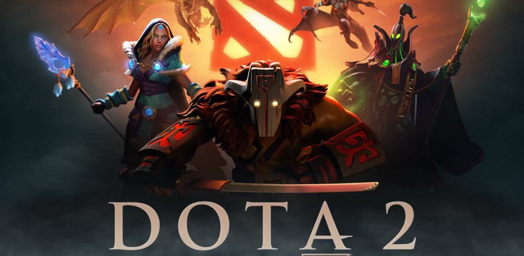
For the past 5 years I have worked as a UI/UX designer and artist on large-scale mods within the Dota 2 ecosystem, with our custom games surpassing 6 million combined downloads.
I collaborate with a global team of developers and have worked on more than 10 projects, each with its own complexity, where problems such as economy, combat HUDs, inventory navigation, seasonal banners, ranking and leaderboard panels, iconography, logo design and illustration are routinely my responsibility.
Process
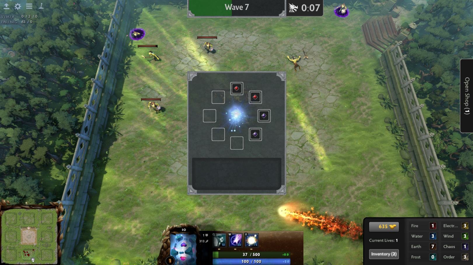
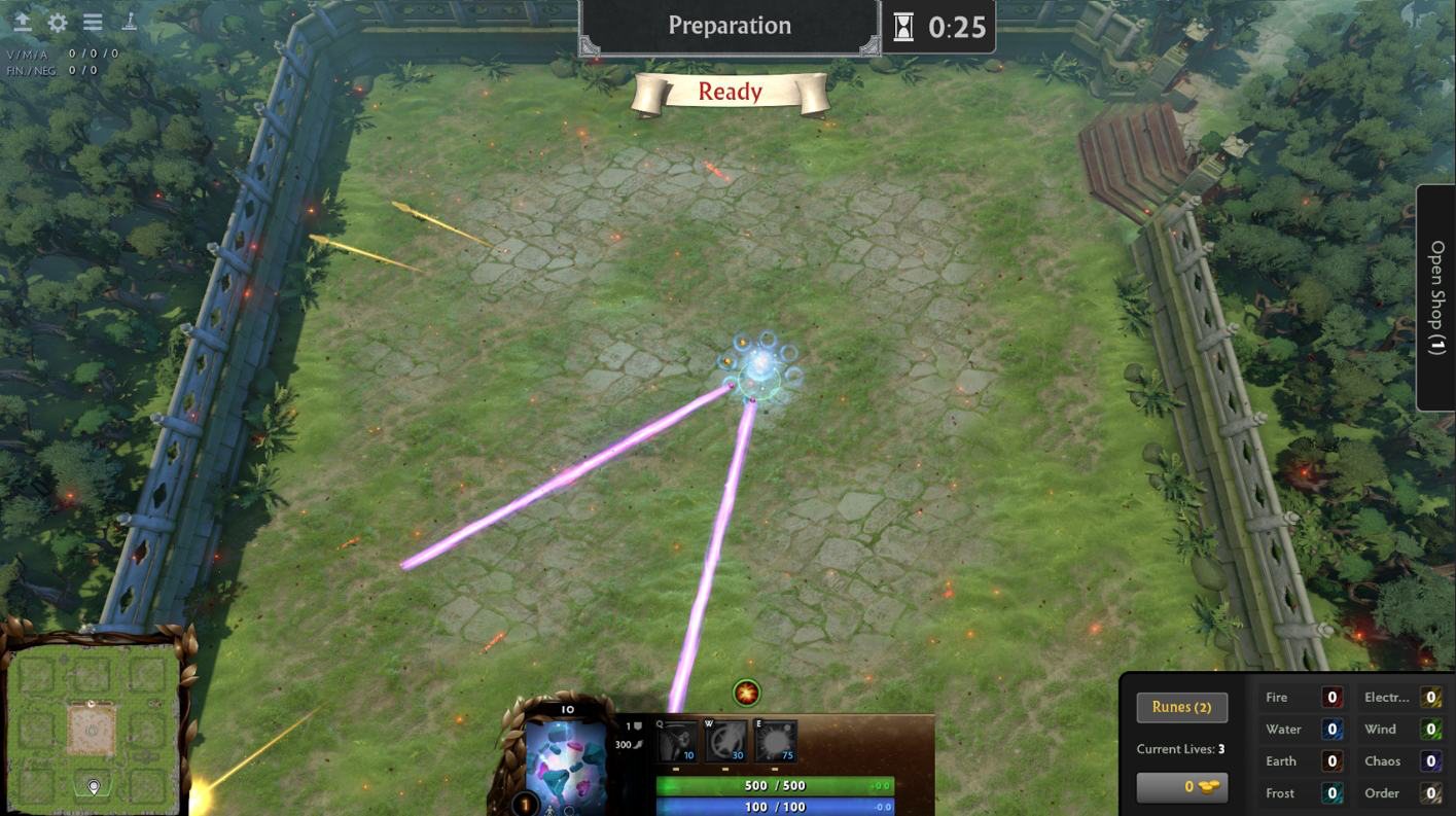
Revolt is a custom game mode centred on high-complexity inventory management. The core loop requires players to manage an 8-slot inventory of elemental runes, which can be combined up to 3 times — creating an exponential number of attack variations.
↗ Link to the Steam Community page
The mod’s challenges centred on:
- Reducing the cognitive load of identifying elements during fast-paced combat;
- Smoothing the learning curve for the rune-combination mechanic;
- Designing the complete visual identity, including logo creation and production-ready UI assets optimised for the Source 2 engine;
- Establishing player feedback loops through user research, to validate the onboarding flows and the clarity of the HUD.
↗ Read the full documentation on Notion
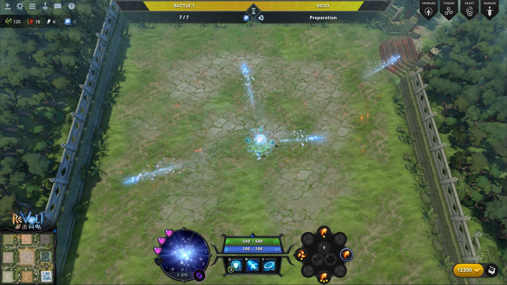
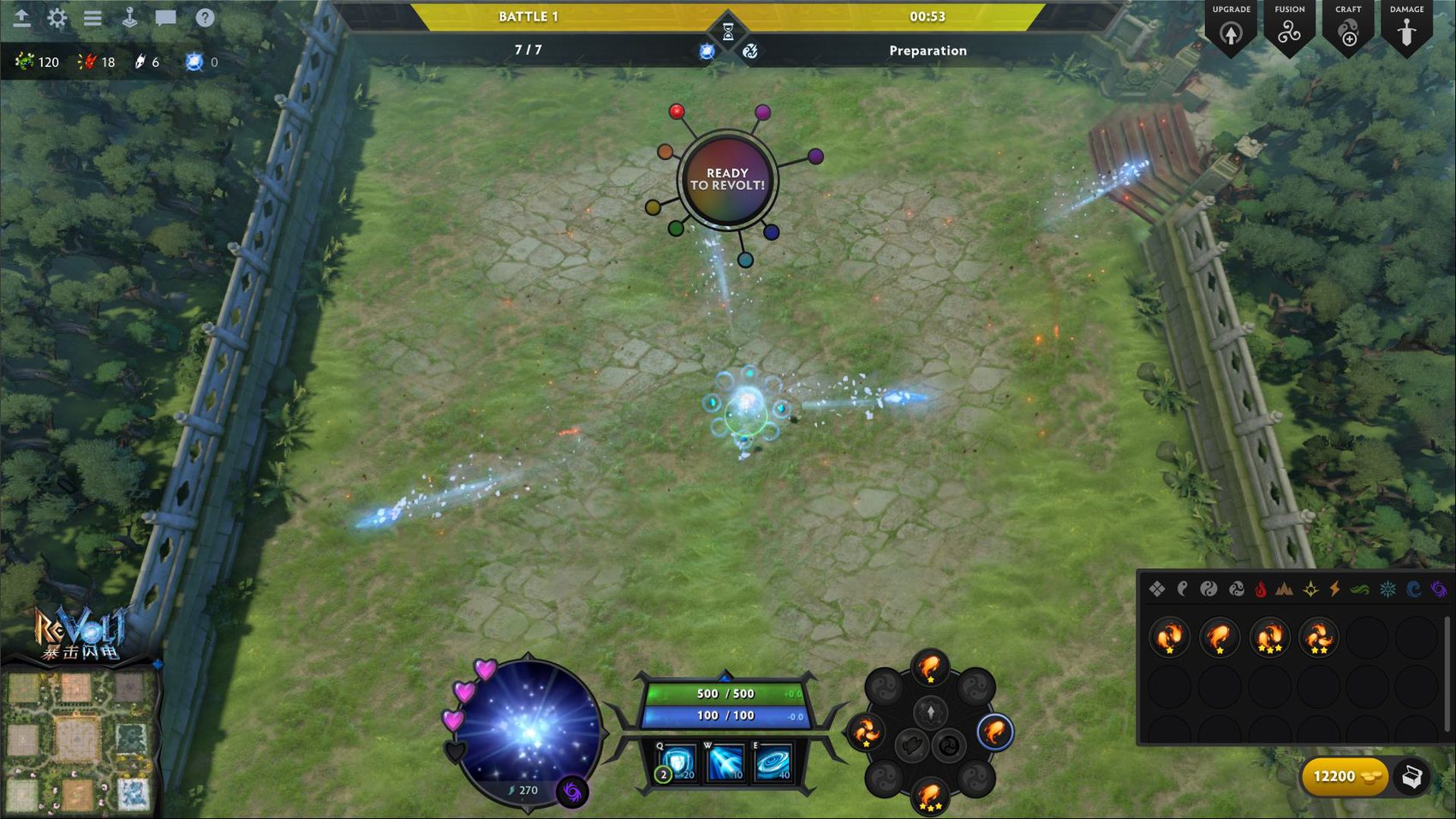
To optimise the core gameplay loop, I restructured the main player portrait component into a centralised hub for fast management. By relocating the primary actions to the lower quadrant, players can equip, unequip and use quality-of-life features easily — such as one-click Auto-Upgrade — significantly simplifying management during combat.
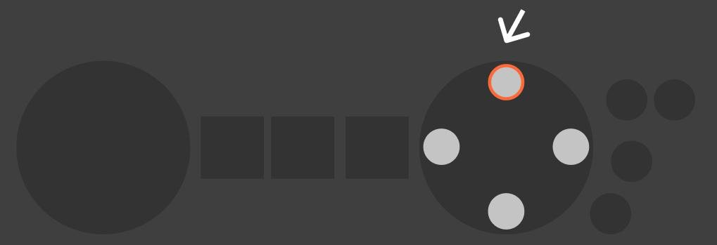
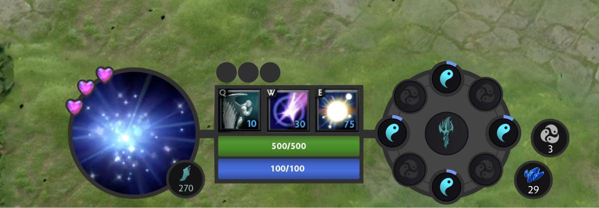
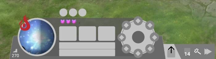
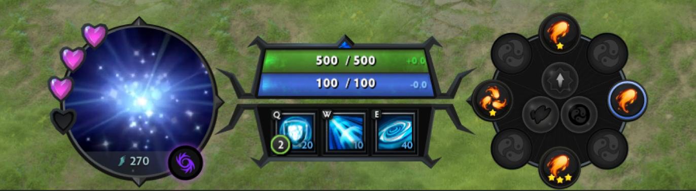
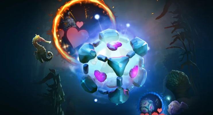
I always look for narrative references so the interface carries a deeper meaning within the game’s story. The main inspiration was the circularity of the hero himself — IO is a sphere — and I also drew on elements from the Dota 2 × Portal crossover skin.
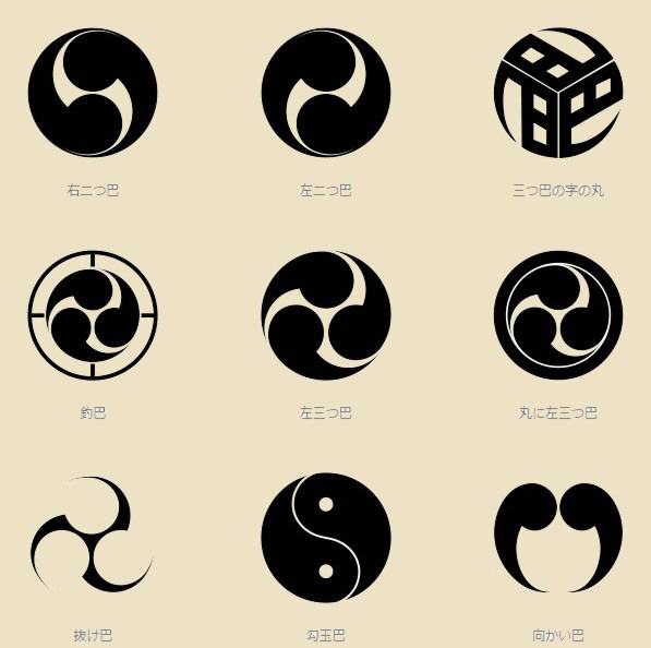
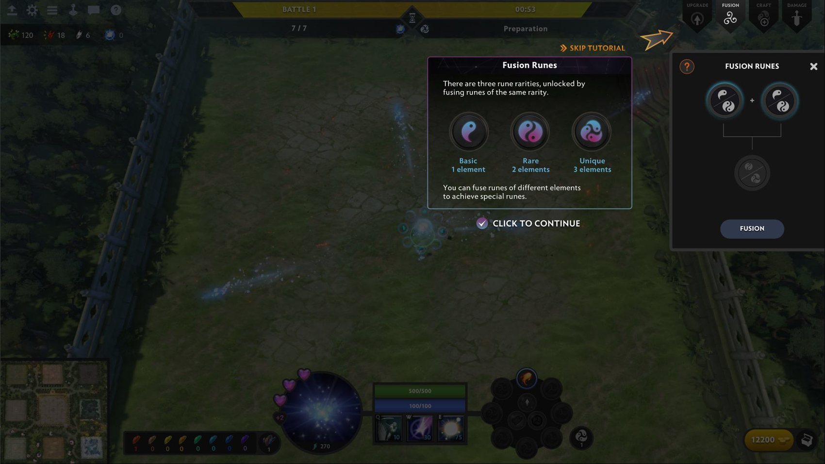
To solve the rune scalability problem — the combinations are effectively infinite — I used the Magatama shape as a reference, which let elements merge without requiring a distinct icon for every new rune.
Interfaces
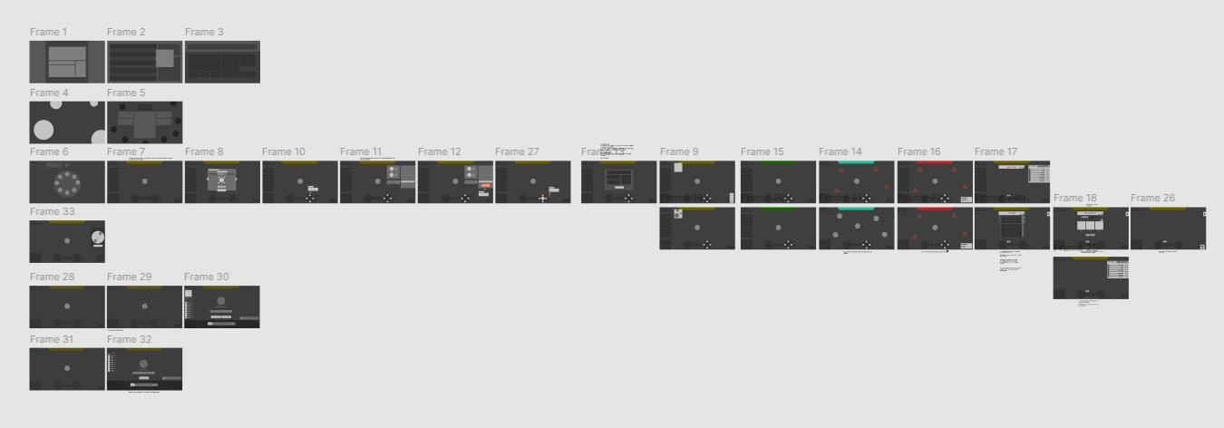
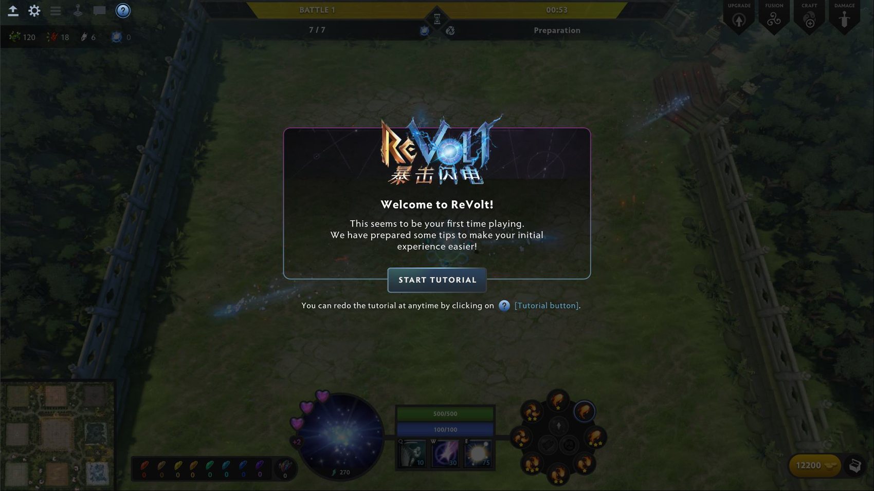
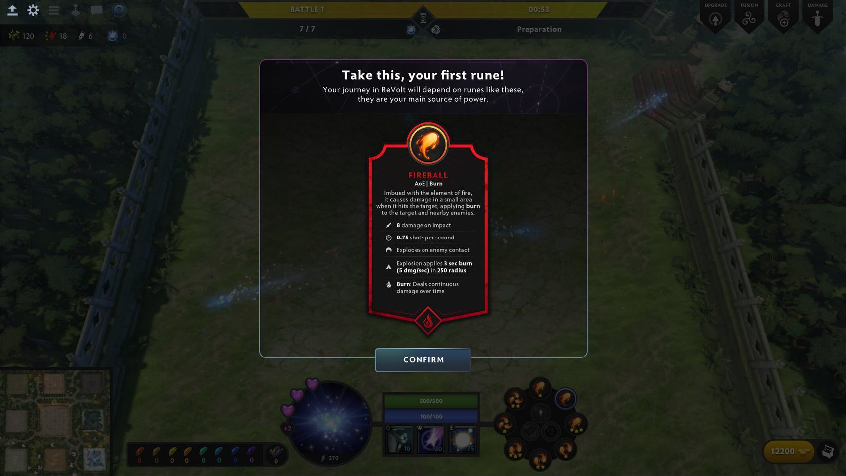
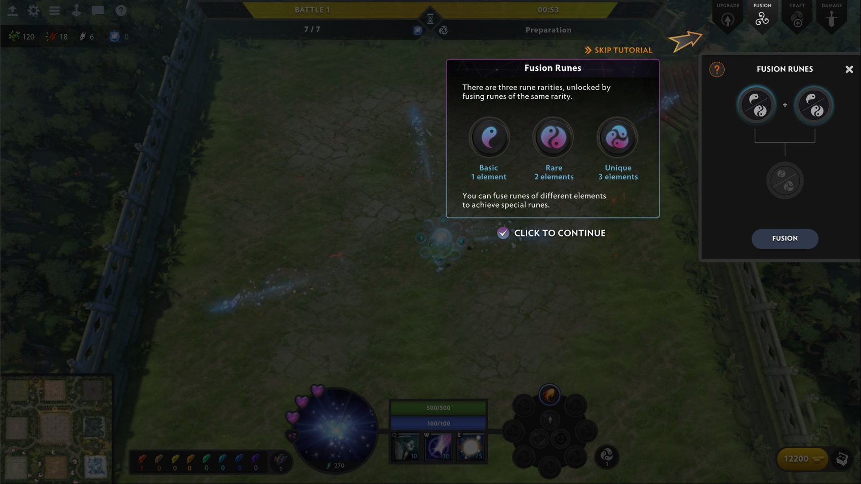
Every interface goes through sketching, a low-fidelity animated prototype to test flow, and a high-fidelity prototype to validate the visuals and final interactions.
Assets
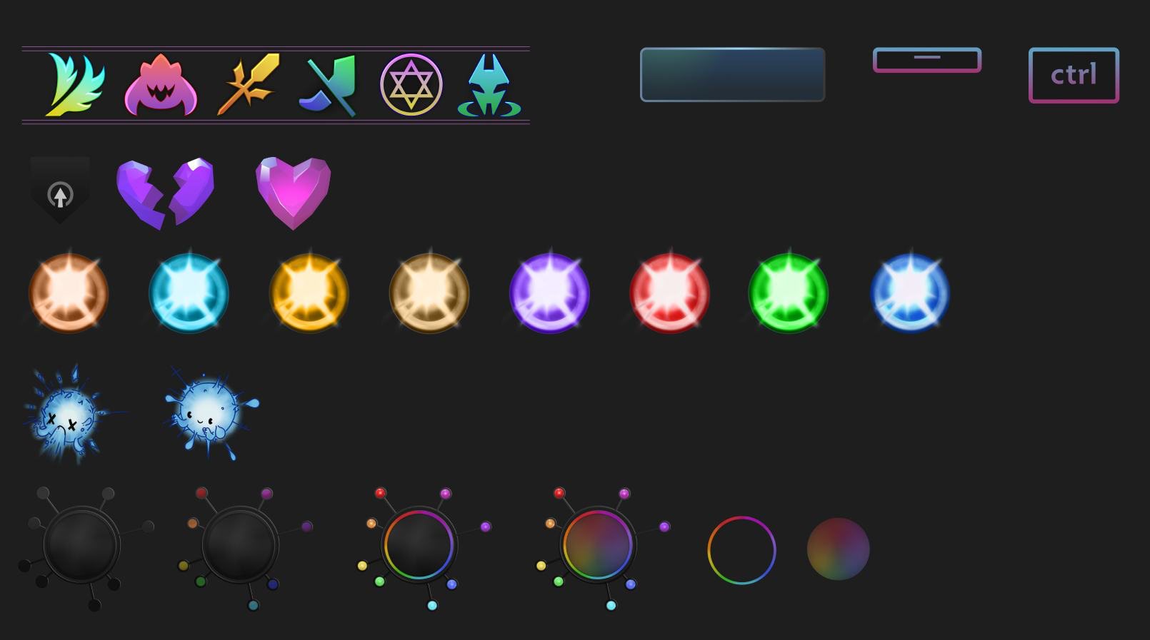
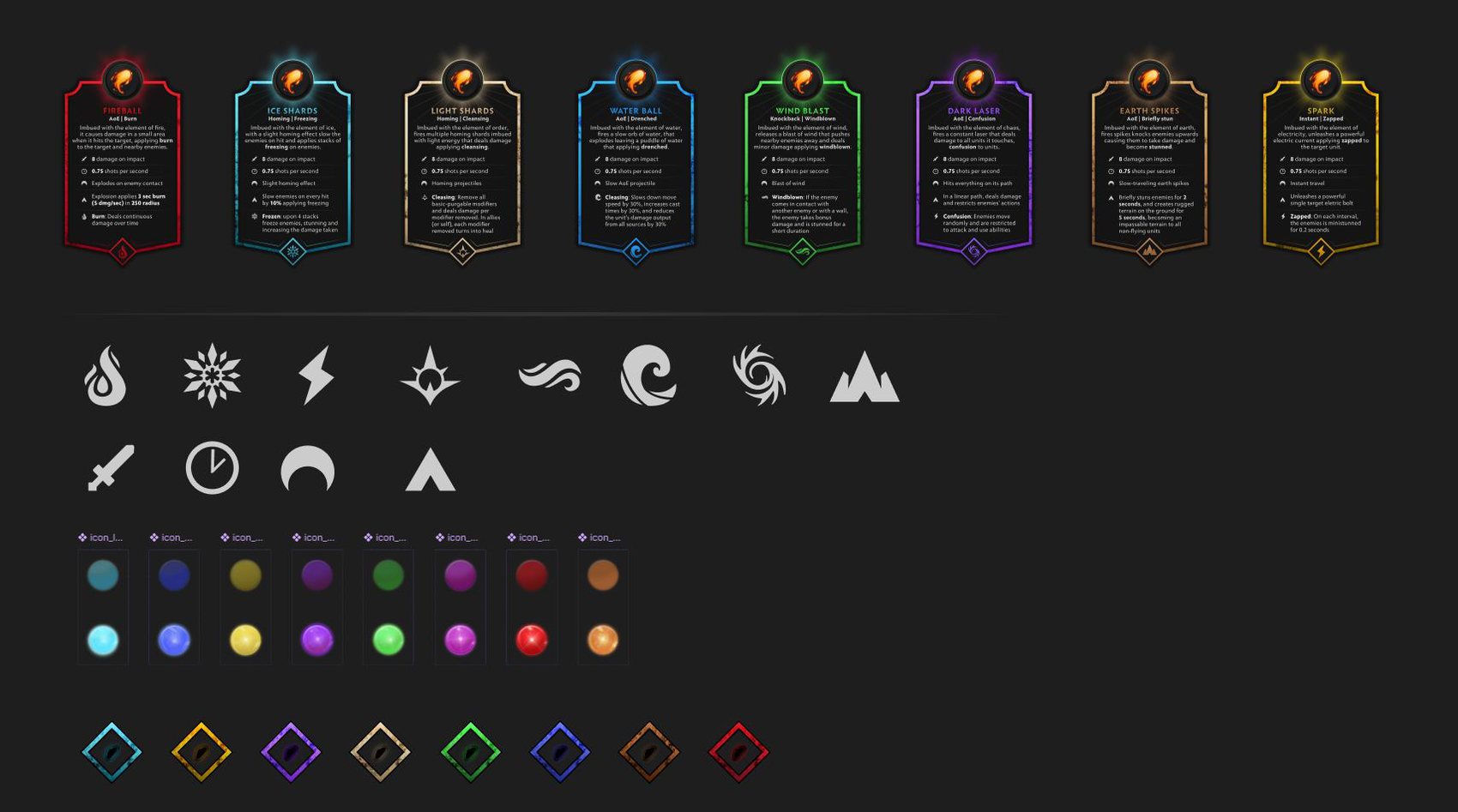
All assets were organised in Figma for the development team to access and control.
Logo
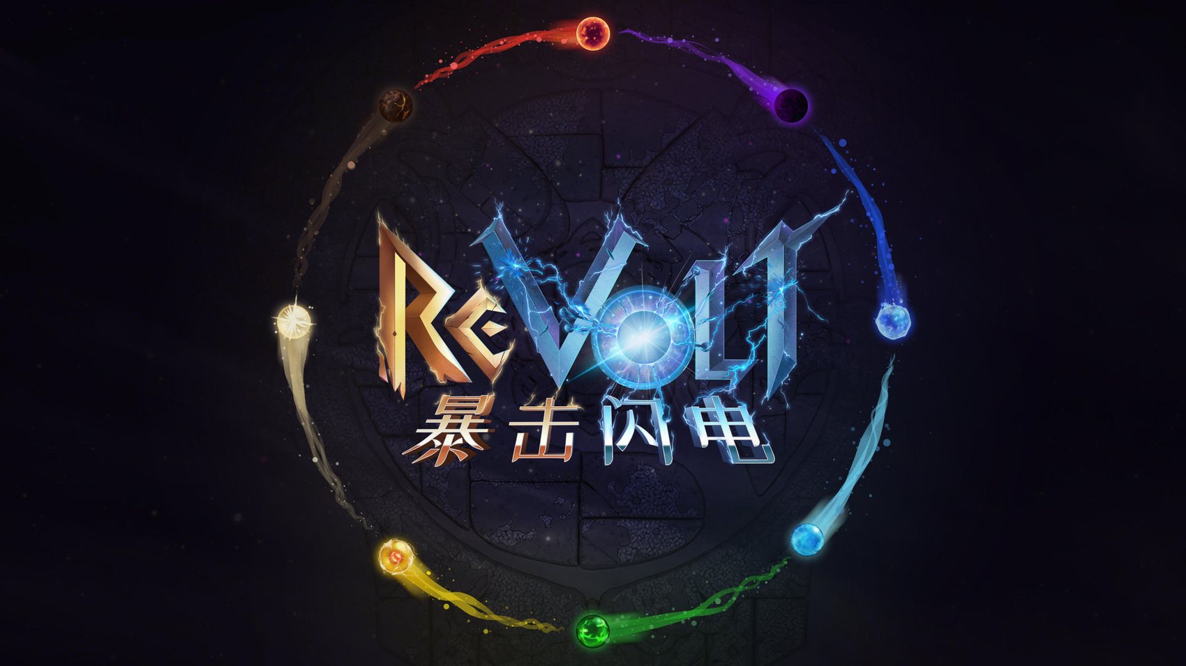
The logo grew out of the game’s narrative concept, using IO as the letter O with the elemental runes around it to hint at the gameplay dynamic and the mod as a whole.
Other mods
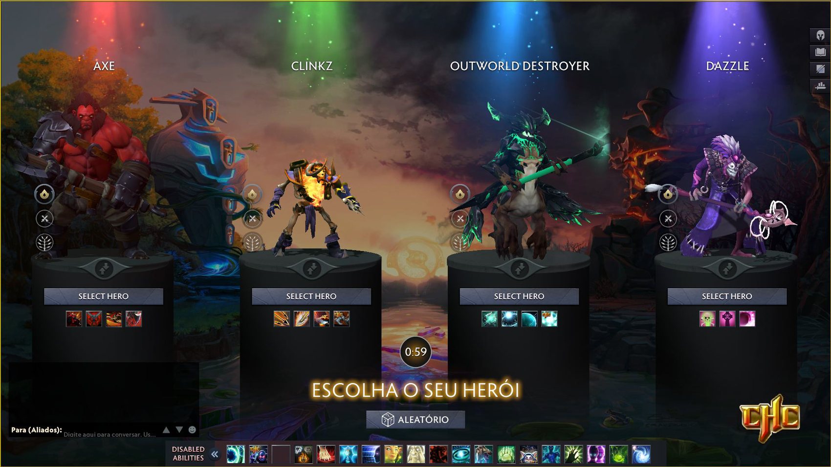
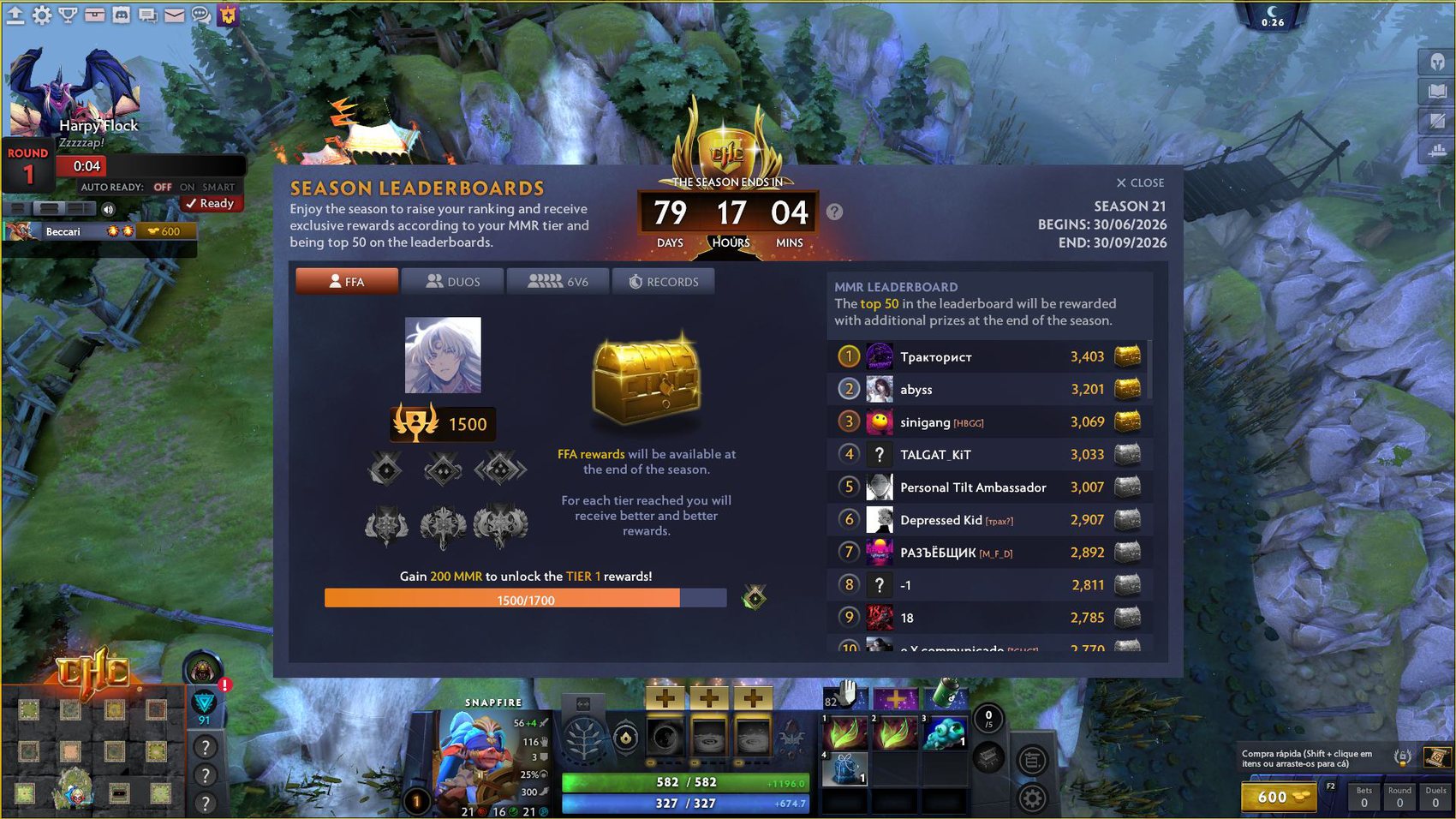
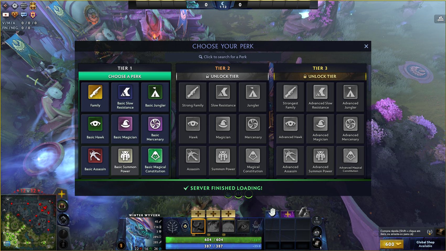
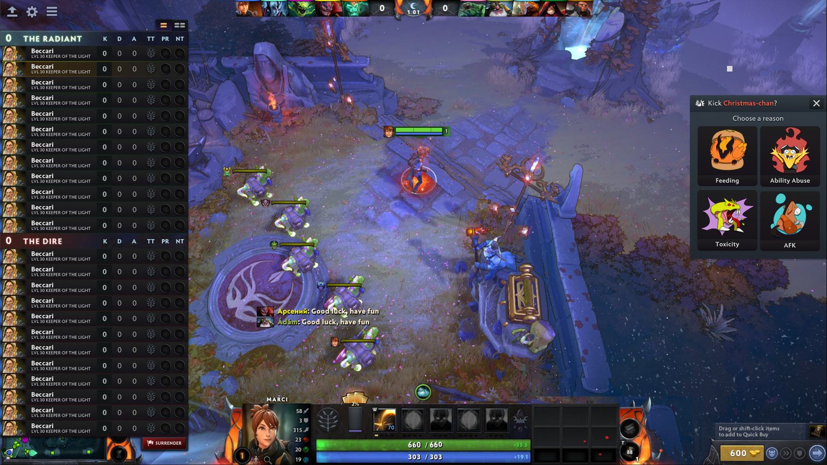
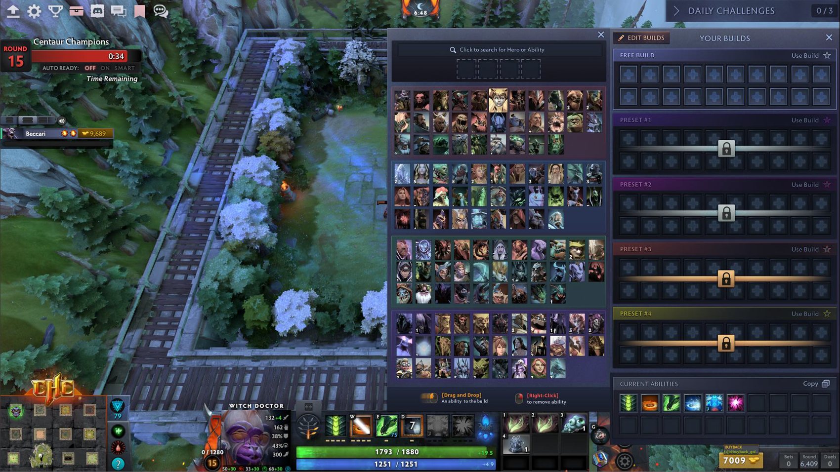
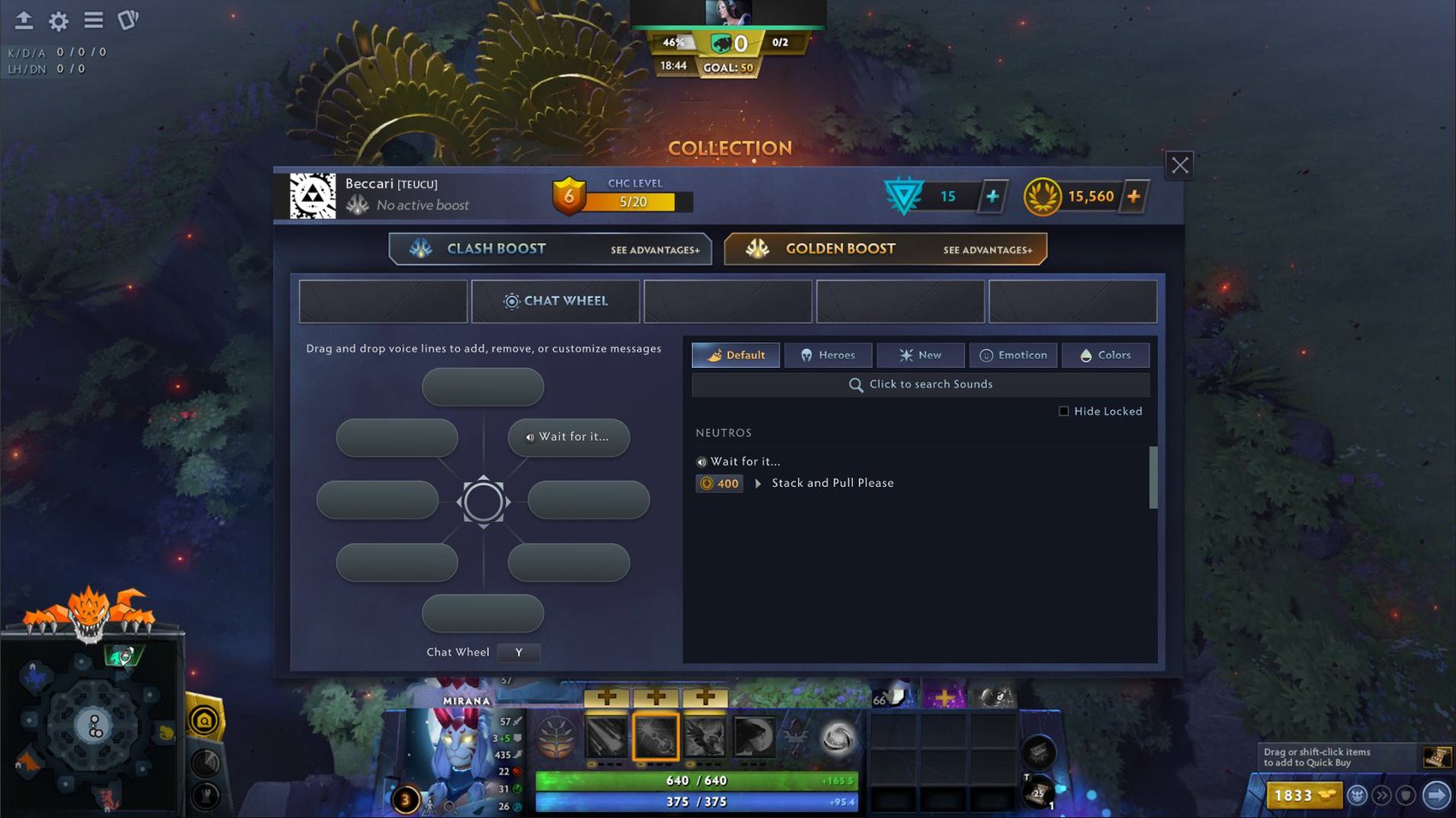
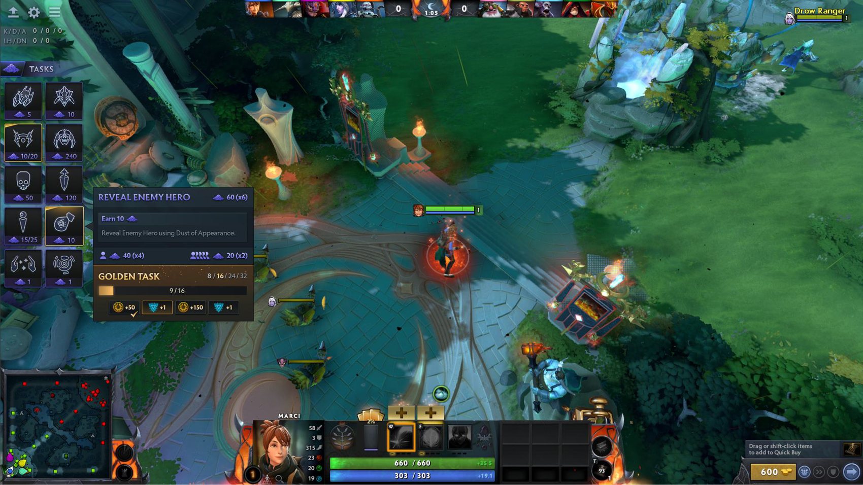
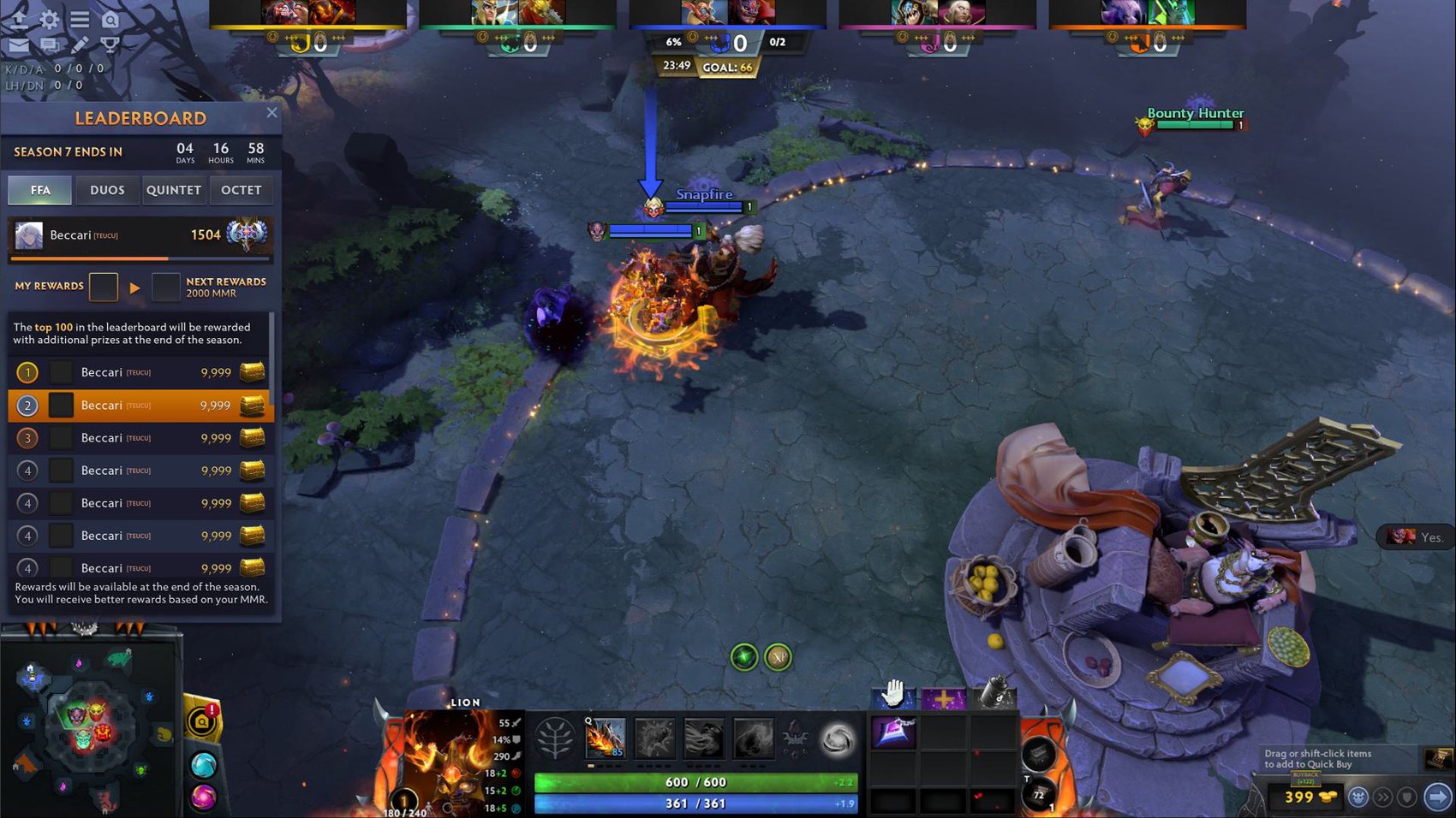
Screenshots of some of the live interfaces in the newer mods.